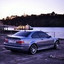
And now for today's edition of @Karter16's Random Side-Quests.
On my to do list is the radio/nav. I've spent a lot of times working through various options and they all make me sad to some degree as there just aren't any options out there that give me the combination of OE-like and modern functionality that I'm looking for.
The current trend in the E46 M3 world seems to be towards minimalism which is fine, but for practicality reasons I want to swap to a touchscreen nav setup that I can run CarPlay on etc. Ideally this looks OE-like, however having said that I'm not a fan of the dated "screen with buttons around it" arrangement that the original E46 nav had. Times have moved on with technology and it's unnecessarily pokey (in my opinion). That said I don't particularly want a big slab of a tablet stuck on the dash either. I'm currently tilting towards something like this Xtrons unit:
This in itself makes me sad, as I would like to steer well away from the cheap electronics, but that said none of the main manufacturer's offerings enthuse me either. I'm inclined at this point to give the Xtrons a go. If it's rubbish/not reliable then I'll try something else instead. I'm technically competent so don't mind some effort to get things working well, I just need them to be reliable once I've got them setup...
Anyway, back to my morning cup of coffee quest...
Regardless of what option I go with, I want to make it feel as OE as possible. One aspect of that is replicating the original boot/splash screen used on the OE Nav. Now of course the OE Nav is more than 20 years old at this point and the original image is low resolution:
I had a decent search on trusty google but was unable to locate a high-res reproduction of this image, so I decided to make my own.
I actually used Figma to do this, which is a bit of a random choice, but I'm very familiar with it and its capabilities are more than sufficient for this project. Secondly Figma is a vector image tool, so what I'm producing here is a vector-based image which I can then use to output whatever resolution I like with no loss of image quality.
Upscaling images by hand, especially graphics/text is part math and part subjective tweaking. To start with I take the source image, resize it to a suitable scale to work with on the canvas (I chose 1280w, large enough to see detail, without being too large and unwieldy). I then started overlaying the text and graphic components. When doing text I tend to use a contrasting colour so that I can get the sizing, etc. approximately right and see what I'm doing:
Often the challenge can be working out exactly what font has been used. BMW made this nice and easy for me in this instance as they use their own "BMW Helvetica" font for everything 🙂
Once I figured out the exact size to set the font to, which is trial and error, I was then able to roughly put in the bars with the linear fades on each side. Getting the proportions of the fade right is again just trial and error and viewing at different zoom levels to judge what's right.
I squared everything up and had an image that looked pretty much like the original, but higher quality. The next step is make sure it replicates the original as closely as possible which is a lot of tweaking and pixel shuffling. I find that the best way to do this is to take the image you've just produced and output it at the same resolution as your original image.
This gave the the following:
Looks pretty good huh!
Actually when we look at the original and the reproduction side by side (repro on top, original on bottom) we can see I haven't quite got it right.
In the reproduction the BMW text is slightly to the right. This is because I centred the text in the image between the fade bars which I made of equal width on both sides. Doing that on the face of it makes sense, but there's a good reason why BMW tweaked it slightly.
If we look at this side by side (repro on top, original on bottom):
We can see that BMW actually made the fade bars on the right hand side slightly wider than those on the left, this is to account for the fact that only the top right edge of the W extends fully to the right of the bounding box for the text, whereas the B on the other side is hard up against it. Although in my image the text is dead centre and everything is symmetrical, the perception to the eye is that there is more whitespace (or blackspace in this case) after the W than there is before the B. To account for this BMW actually made the fade bars on the right hand side come across to the left just a little bit.
So let's adjust it:
Getting closer, just a bit more to go:
Now we're looking pretty good!
It was a number of iterations to get to this point, but now things are looking pretty similar between the two. I'm happy with this now.
All of that work means that I how have a fairly faithful, high res, reproduction of the original image ready to go for when I need it.
This is pretty niche so I can't imagine anyone else really having any use for this, but if you do you're more than welcome - SVG and PNG downloads below 🙂
SVG
E46 BMW Nav Splash Screen Vector.svg
1280w png
2560w png


